ipad

iPad App of the Week: Phaidon Design Classics

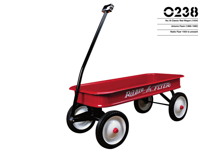
Radio_flyer_red_wagon_phaidon

Phaidon Design Classics is a book (or really, a three volume set) for design nerds like me. In it they curate and chronicle 999 objects that they deem are noteworthy for their innovation, influence and are "perfect in their design." The objects are numbered and ordered chronologically, starting with Chinese household scissors from 1663 and ending with the most modern products of today.

Though you could buy the three volume set at Amazon for $110.25, for $19.99 you can get all of that content and more on your iPad - plus an extra product (product 1,000 - the suitably chosen iPhone). It's an awesome collection of things both historical and current, allowing you to browse through not only the history of object design but human history as well.

The interface is fairly easy to understand, and while the clicking sounds it makes when you transition to a new object are kind of hokey, they do help you navigate through the enormous collection. You can also narrow down the number of objects shown by choosing categories or by running keyword searches on the titles and descriptions.

Running a search on "children" yields 49 results, among which there are some of the things you might expect, like the Mammut Chid Chair sold by Ikea, the Tripp Trapp Child's Chair from Stokke or the Eames Hang-It-All. There are also many objects that are taken for granted but are nevertheless incredibly innovative, like Crayola Crayons, Pez candy dispensers, the very first Jigsaw Puzzle (made in 1776), or the very first Teddy Bear (made in 1902). I must admit that I never really gave much thought to the Classic Red Wagon from Radio Flyer (pictured), but two paragraphs later not only do I know the history behind how it was designed and developed, but I appreciate it all the more.

Phaidon Design Classics for iPad by Phaidon Press, $19.99 from the iTunes App Store.

Great iPhone Apps for Kids: Cookie Doodle

CookieDoodle

Cookie Doodle for the iPhone, iPad and iPod Touch is a great app for kids for three big reasons:

  1. It's fairly easy for children 3(-ish) years and older to understand and use without constant help from Mom or Dad.
  2. Instead of a game that rewards with a score or unlocked levels, it encourages simple creativity. The reward is the cool thing you make.
  3. It's $0.99.

Cookie Doodle is an app that lets your kids go through all the steps of making a "virtual" cookie, from rolling out the dough, baking it, decorating it and eating it. Kids can pick from huge lists of types of dough, frosting, and other decorations. The app is also updated constantly for holidays, so right now for instance the app is configured for Valentine's Day cookies. But even if your child can't read yet, the interface is still simple enough to figure out how to use.

My daughters, especially my youngest (4 years old), love this app. Lots of apps for kids take a few minutes of their attention before they get bored, but when they're using Cookie Doodle they probably spend more time on it than any other app. There are so many choices and steps until the cookie is finished, that once they finally complete what they are working on they've already thought of another creation to make.

Trust me. Put it on your iPhone and hand it to them when you get to the restaurant, and before you know it you'll make it to when the food arrives with no drama. That is, unless they're fighting over who's turn it is to make the cookie.

Cookie Doodle by Shoe The Goose is available for $0.99 from the iTunes App Store.

A Tip for Flipboard for the iPad That Makes It More Awesome

Flipboard_icon

If you've got an iPad then chances are you've downloaded Flipboard. (Over)-simply put, it takes content off of the Internet and presents it all in an interface not unlike Time Magazine. But the best part is it also takes the content from your social media feeds (Facebook and Twitter specifically) and puts it into Flipboard - resulting in something that makes you feel like you're reading your own personalized magazine.  Plus, it's free so there really isn't any reason to not try it. 

I'm a fan of the app, but I've recently discovered a great tip for getting an even better and more personalized experience out of it. 

In addition to your basic Twitter feed, Flipboard will also let you subscribe to all of the links and content generated by one of your Twitter groups. This doesn't seem that special, until you stop thinking of your Twitter groups as something helpful for grouping the people you follow on Twitter and start thinking of them as a way to group cool content for Flipboard.

(I should stop here and say that I completely ripped off this idea from Chicago Sun Times columnist Andy Ihatko who gave up the idea on this week's Macbreak Weekly podcast.)

The first thing you need to do is find Twitter feeds that send lots of links to content you want to read or otherwise enjoy. If you don't use Twitter, then just sign up and start following. Twitter feeds of websites seem to work best (as opposed to specific columnists for instance) because those accounts are often used specifically for sharing links to new content, though any Twitter feeds you are partial to will work. Then, just make sure that the feed is set to "Public" as opposed to "Private" and go back to Flipboard and add it as a feed.

This simple thing has easily doubled my enjoyment of Flipboard. I can still go back through my Facebook feed and see what kind of links and pictures my friends have posted, but then when I'm done I can also check out the coolest Wine/Photography/Technology/Politics/Arts iPad magazine available.

If you're interested, you can check out the list I generated (I call it "MojoList" in honor of Andy's "the-mojo-wire" where I got the idea from originally), but I would suggest you use it (or another) as a jumping off point to create your own personalized piece of awesomeness on the web.

That is, if you've got an iPad. (Trust me, Flipboard might be reason enough to get an iPad.)