Furniture/Decor

Hello Kitty Clock Radio and CD Player - My Daughter’s Review

Hello_kitty_clock_radio_cd_player

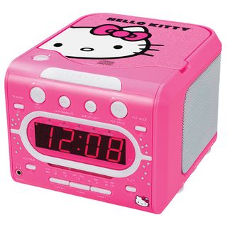
My seven year-old daughter was needing an alarm clock for her bedside - not because she needs to set an alarm yet, but mostly so she could play CDs and listen to the radio on something that wasn’t a hand-me-down. The Hello Kitty clock radio had all the things we wanted (alarm, CD player and radio) so we decided to try it out and review it for Modern Day Dad.

This is what she thought of it:

The clock radio looks really cool in my bedroom because it’s pink and has Hello Kitty on it. I like that it has a radio and a CD player. The best thing about this alarm clock is that they put all of those things together. The clock is very easy to read (because it’s digital) and sometimes in the middle of the night I think to myself “What time is it?” so I look at the clock. It has an alarm too, but I don’t use it.

I do not like how you change the radio stations. It only has a little dial on the side and it’s hard to use. The CD player is easy to use - you just open it and then press the power button. The sound of the clock radio is good.

I think the people who should buy this are girls who don’t have a radio or an alarm clock and like Hello Kitty.

When given the choice between something that will function reliably and something branded with a cartoon character, most kids will usually pick the thing with the cartoon character on it. (And my kids are certainly no exception.) While the Hello Kitty “am/fm stereo dual alarm clock radio with top loading cd player” is certainly something you buy because it has Hello Kitty on it; for a kid’s clock radio it seems well built and more than reliable.

Hello Kitty Stereo CD Alarm Clock Radio, $69.99 at Sanrio.com (this version isn't up on Amazon.com yet)

iPad App of the Week: Phaidon Design Classics

Radio_flyer_red_wagon_phaidon

Phaidon Design Classics is a book (or really, a three volume set) for design nerds like me. In it they curate and chronicle 999 objects that they deem are noteworthy for their innovation, influence and are "perfect in their design." The objects are numbered and ordered chronologically, starting with Chinese household scissors from 1663 and ending with the most modern products of today.

Though you could buy the three volume set at Amazon for $110.25, for $19.99 you can get all of that content and more on your iPad - plus an extra product (product 1,000 - the suitably chosen iPhone). It's an awesome collection of things both historical and current, allowing you to browse through not only the history of object design but human history as well.

The interface is fairly easy to understand, and while the clicking sounds it makes when you transition to a new object are kind of hokey, they do help you navigate through the enormous collection. You can also narrow down the number of objects shown by choosing categories or by running keyword searches on the titles and descriptions.

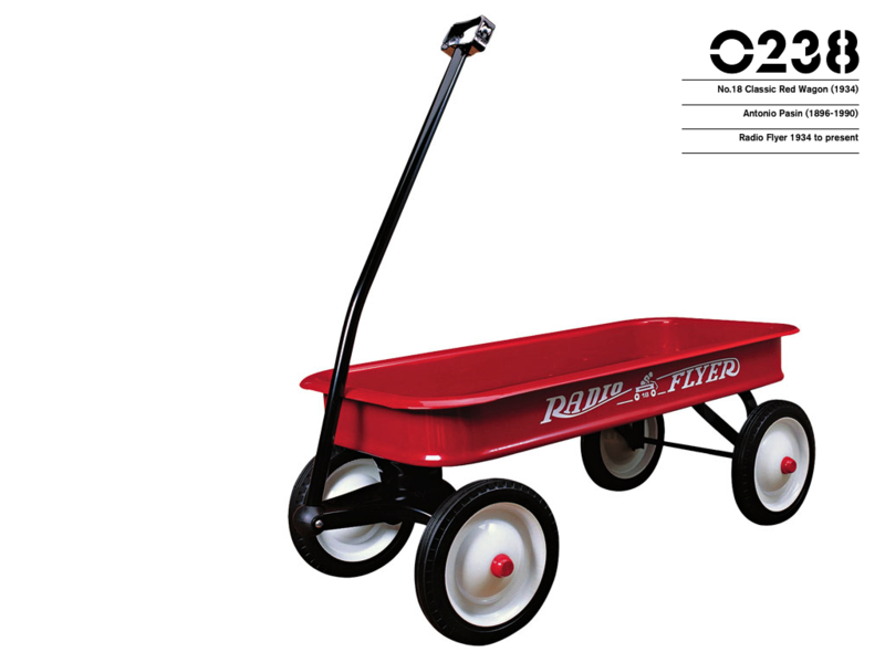
Running a search on "children" yields 49 results, among which there are some of the things you might expect, like the Mammut Chid Chair sold by Ikea, the Tripp Trapp Child's Chair from Stokke or the Eames Hang-It-All. There are also many objects that are taken for granted but are nevertheless incredibly innovative, like Crayola Crayons, Pez candy dispensers, the very first Jigsaw Puzzle (made in 1776), or the very first Teddy Bear (made in 1902). I must admit that I never really gave much thought to the Classic Red Wagon from Radio Flyer (pictured), but two paragraphs later not only do I know the history behind how it was designed and developed, but I appreciate it all the more.

Phaidon Design Classics for iPad by Phaidon Press, $19.99 from the iTunes App Store.

A City Map of Neighborhoods from Ork Posters

Orkposter_boston
Ork Posters! is a small company born out of etsy.com (I wonder how many small businesses got their start on etsy?) that makes amazing maps - primarily of cities - where each city is divided up into the individual neighborhoods. At the root of each poster is simple design that shows something you thought you already knew in an engaging way. It doesn't get much better than that.

Oh wait. It kind of does.

In addition to posters they also offer screen prints for only slightly more money. But having just received the Boston screen print (shown above) I can tell you they are worth it.

Ork also makes a couple other "maps" - a map of the heart, one of the brain and one of the Great Lakes. Unfortunately there are only 15 cities available so far, but they assure me that more are on the way. You can also suggest a city via email, so I immediately fired one off to ask for my city of Las Vegas and got a very nice reply. Who knows if it will happen, but if it does I'll be the first in line. I the meantime, I'll enjoy my new green and white Boston screen print.

Ork Posters! are $22 for a poster and $27 for a screen print, available at OrkPosters.com

Jennifer Lopez's Nursery and Other Recent Posts On Babble

Casablanca Cribs in Jennifer Lopez's Nursery
Jennifer Lopez has a (typically) ostentatious nursery and published pictures of them in People Magazine. But the crib is actually quite nice if that kind of decor is up your alley.

Audible Launches New Kids Site
Download audio books for your kids and stop putting Spongebob on their iPods.

7 Days of BPA-Free Plastics: CamelBak Water Bottles
Something to check out when you reach post-sippy cup nirvana.

Jessica Alba Gives Tastybaby
Jessica Alba gives baby food as a party favor for her shower. Seriously.

Mariah Carey Has a Hello Kitty Boo-Boo on American Idol
Mariah Carey is obsessed with Helo Kitty apparently. And she wears the same Band-Aids on American Idol that my kids wear.

Big Deal: FLOR Carpet Tiles for Kids On Sale
FLOR has a couple of child themed carpets on sale now.

Ikea Hacker

Ikea_girlsbedSo I was looking at the Twitter Public Timeline today and I saw a post that caught my eye - Ikea Hacker. Maybe I'm late to the party, but this is a pretty sweet idea for a blog. Anyway, the top post was about how to hack together a pretty cool girl's bed (pictured).

I've always loved how Ikea keeps good design affordable, but you kind of have to use it in small doses. Making adjustments so things will fit your life is just smart. And if you screw it up don't worry, it probably didn't cost you much in the first place.

Kid's Bed With A Little Cupola [Ikea Hacker]

Also, check out all the posts tagged with "children" on Ikea Hacker.

Baby number two bassinet breakdown.

OobaI've spent (some would say ridiculous amounts of) money on baby furniture in the past, like the crib we got from the Netto Collection. Sure it was expensive, but the nursery is still my favorite room in the house, and we've got at least another three years to enjoy it. I've also in the past decided to go with the more frugal option too. For a while I was really in love with the Nest high chairs from England, but with those Ikea chairs looking good (and a full decimal place and a half cheaper) I couldn't justify it.

But now this new baby is coming and I've got to figure out a place for him or her to sleep. When Madame was a newborn we just kept her in the Bugaboo bassinet and wheeled her around the house for her many naps. But she's still using her stroller, which means I need a new bassinet solution.

There are some really beautiful ones out there (two years ago all we had was Netto...), the newest being the Ooba "Nest Collection" bassinet (pictured). Sure, it's modern and will look great in my bedroom, but $500 for a piece that will only be used for two months? Not even I,  the king of conspicuous consumption, can justify it.

But everything else that I've found are these frilly, lace-laden monstrosities. Look at the bassinet page from Target.com here. Even at $70, I just can't honestly bring myself to buy something that looks like it came out of some ten year old girl's Barbie Dream Nursery fantasy.

So what's the solution? I think what I'm going to do is borrow a frilly bassinet from a friend for a couple of months. That way the baby will have a place to sleep that's comfortable and nearby, Madame will get to keep riding in the Bugaboo and I won't have to spend money on something ugly.

And we'll keep the bedroom door closed.

Also on MDD: High (chair) decisions.

Modern design baby blog-a-palooza.

See? I told you the kid's modern furniture revolution is taking place. To celebrate two new categories of products ("kids" and "baby"), modern furniture store Design Public is now in the second week of what they're calling their "Baby Blog-a-palooza!" It's a great idea actually - they've asked product and textile designers as well as popular parenting bloggers to write an entry about design as it pertains to children. (Apparently I wasn't popular enough to be among the "popular parenting bloggers" - even though I've been preaching the modern kid's stuff revolution for almost a year now. *tear*).

Anyway, it's definitely worth checking out. I like the posts by the designers, particularly Sophie Demenge from Oeuf, and I have to admit some of the posts by the other bloggers are really good too. It's great that people are talking about good design for kids, and it's even better that now there are more and more places to get it.

(I was going to include a list of all the the cool kid's stuff I've writen about in the past, like Blik wall decals (with a picture of part of our nursery), or my search for the perfect high chair, but then I realized I should probably just link to my Furniture/Decor category.)

Check out more modern kid's furniture and decor on Modern Day Dad
.

Toy solution.

Ikeabasket

Recently I've been trying to figure out where I can keep Madame's toys so that they are:

  1. In their own place and in a place only for toys.
  2. Accessible and in a place where she can get them without hurting herself.
  3. In a place or receptacle that isn't ugly.

So far I've found one good place, a flower storage basket from Ikea kids (pictured). It's good because not only does it look kind of cool, it's made of cloth and a big spring. This allows it to keep it's shape and be soft enough so that if the baby pulls it down she can't hurt herself. Plus at only $9.99 it was a bargain.

PYRE storage basket. For girls (pink flower) and boys (blue monster). $9.99 from Ikea.

Pop up photo ball.

PhotopopupballOne of my most favorite stores, Organized Living, is going out of business. This bums me out in a huge way, but I suppose they couldn't make it selling drawer organizers and modular shelving. Anyway, life goes on, so I went to the liquidation sale yesterday to see what I couldn't live without. I got some sweet stuff, among which was the Melannco Photo Pop Up Ball.

Like all brand new toddlers I'm guessing, Madame has been really into pictures lately so we've been trying to find a way she can play with them and not destroy them (or the frames). The pop up ball is a plastic 14-sided "ball" with clear pockets on each side that you slide photos into. It's, light enough for her to play with, keeps the pictures safe, and even collapses and pops up as a bonus. If you ask me it's kind of ugly for real life, but for her it's perfect.

Pink, Blue or Black Pop Up Photo Frame only $2.74 on clearance at Amazon.com. Sweet! (If they marketed it to kids maybe it wouldn't be on clearance.)

Pink art.

JustalittlegirlI went to an art show last weekend which was (unfortunately) rather uneventful, but I did see a couple of cool things. One of which was this artist called Fanok who makes these illustrations around a theme of a little girl. Aptly titled "Just A Little Girl," the prints show his character tackling all kinds of bizarre circumstances, in a pink dress. Kind of like a Shepard Fairey/Obey thing except with a completely different motif. I thought they were interesting, and though I didn't buy one for Madame's room, I considered it. It might be something worth checking out if you're looking for something cool to hang on the walls of your daughter's room.

Just A Little Girl website.

Teutonic rocking.

RockingchaircradleSometimes all you have to do is ask. After getting an email shout-out from MDD reader and Berlin native Bettina, I asked her if she had any cool modern baby stuff from Germany to share, and she sent me this link to the RH-tire and the RH-babe. German wasn't one of the languages I opted to take in high school, but from what I can tell (with some help from the Google translation and Bettina's email) it's a combination rocking chair (RH-tire) and crib/cradle (RH-babe).

Even though I don't know anyone who has actually used a rocking cradle, it's a pretty interesting idea that I'm surprised I haven't seen before. Personally, I think it kind of looks like something Ikea should have thought of (maybe it's the wicker), but it's got nice clean lines and certainly would be a conversation starter with guests.

I can't figure out how many Euros it is, but here's the re-tire website (in German).

Got an idea? Call a handy Grandpa.

BookshelfMDD reader Anna saw my post about the sling bookshelf that faces books outward so kids can see the book covers and loved the idea for her impending arrival. She didn't however love the design, so she enlisted her handy father to make one. Using the picture of a similar one from Pottery Barn Kids (I don't think they sell one anymore), her father made the one pictured. She said it cost about $20 in materials from Home Depot (most of the cost was paint) and the only tools used were a rotary saw, drill and maybe a hammer. Lucky for Anna the carpentry skills were free.

Nice job (soon-to-be) Grandpa. I'm thinking it looks like a project Home Depot should use for one of their Home Depot Clinics.

Nelson clocks for kids.

Tucan_clockA while ago I was thinking about getting a clock for Madame's room - something she could enjoy when she got older but would look great too. Staying with the big dot theme of her nursery, originally I was thinking about one of the George Nelson ball clocks. They look great, but a clock without numbers doesn't seem like a good idea for a child's room (You see sweetie? When the big hand is on the red ball and the little hand is on the orange ball it's time for dinner). Then I saw these the other day.

Vitra is now reissuing three animal themed clocks designed by George Nelson - the "Zoo Timers." There is Omar the Owl, Fernando the Fish, and Talulah the Toucan (pictured). Besides having great names (I think I need a friend named Omar), they're colorful, fun and have big numbers. As is far too often, great design (especially from a big-name designer) doesn't come cheap, but they sure are cool.

Zoo Timer clocks $115 at Unicahome

Armshell rockers.

Eames_rockerI noticed the other day in a Design Within Reach catalog that Herman Miller is once again producing licensed Eames armshell rockers (and other plastic armshell pieces). I can only guess that the Eamesian (is that a word? It should be.) fiberglass armshell rockers being produced by Modernica were so popular that Herman Miller decided to get back into the business. DWR has them for only $379, which is pretty competitive with Modernica, though they only have four colors to choose from (Modernica has every color you can imagine) and they're made of some sort of new, enviro-friendly plastic. Personally I think the fiberglass looks way cooler.

The modern day dad suggestion? Get a vintage one if you can find it, or if you're too lazy to hunt one down, get one from Modernica like I did. Honestly, it's a chair no modern nursery should be without.

High chair decisions.

A running theme in my dad-life (and consequently on thisblog), has revolved around trying to find the best stuff for my child without my life becoming overwhelmed by bunnies, yellow ducks and ugly furniture. Some battles I’ll happily loose if it keeps Madame occupied and happy (like her swing does), but some are worth fighting, especially for the things she doesn’t directly interact with. So now that she has started down the path of solid foods, we had to decide on what kind of high chair to get.

NestOriginally I was very interested in getting the Nest chair from Mozzee. It’s a beautiful, modern pedestal high chair that will convert to a toddler’s chair later on. You have to order it from the UK, but because it would be a big part of our lives for quite some time I was willing to justify the expense. And the expense is the real issue – almost $500 (with the exchange rate) before shipping.

KinderzeatThe other high chair option I was coveting considering was the Stokke Tripp Trapp (formerly called KinderZeat). Reminiscent of the Rietveld Zig Zag chair, it’s a clever design that adjusts the foot rest as your child grows. I guess the theory is that if your child’s legs aren’t swinging about wildly in a normal dinner chair, then the child will be more grounded and less wild at the table. It makes sense to me, and it looks great too, though it's really more for kids a little older (starting for kids 1½ years old). It's available for $199.99 at Amazon.com.

AntilophighchairThen I found this simple high chair from Ikea a while back and I realized that I could reach a compromise. The chair is basic, solid, looks pretty good and costs a whopping $15 (with the tray that is). For that price we can double up and get a KinderZeat for when it’s time to transition her out of the high chair and to the dinner table with the rest of us. We got one at Ikea on our way home from Thanksgiving last weekend and it’s working great.

The chair that is, the feeding is more of a challenge.

The Modernist Nursery

The NY Times Magazine printed a pretty good article yesterday about modern design for children - The Modernist Nursery by Elizabeth Weil. It focuses on Melissa Pfeiffer (founder of Modernseed) and her family, as well as designers David Netto and Michael Ryan. The article didn't really offer any revelations (other than there are going to be a bunch of new cribs coming out), but it's nice to see the subject matter getting some attention. The only thing I had a problem with was in this passage:

Contemporary design for kids is really contemporary design for adultswho have procreated. In choosing juvenile products that are less babylike, you could even say that adults not only shift focus away from the youngster as dependent child but also from themselves as parents, playing out the fantasy that Mom, Dad, plus Junior are just cool cats sharing a pad. This illusion is not necessarily bad...

Hey, like it or not the whole family has to live with our children's stuff, and it's great for juvenile products to be babylike, just not ugly. As far as I'm concerned there isn't any reason why "babylike" and "contemporary design" have to be mutually exclusive. It might not always be easy (or affordable) to meld the two, but with stores like Modernseed and designers like David Netto it's getting easier every day. I'm a parent who loves his "dependent child," a dependent child who is also a cool cat sharing our pad. I don't have time to play out fantasies.

Sling bookshelf.

SlingbookshelfAfter amonth or two on backorder, the bookshelf we ordered for Madame arrived the other day and I’m pretty happy about it. It’s the Sling Bookshelf from One Step Ahead. At only about two and a half feet tall, it’s a kid-sized bookshelf that displays the books facing outward (kind of like a magazine rack). The idea is it makes it easier for kids to choose books they want to read (or you read to them), without having to worry about messing up a regular bookshelf. I’m imagining the future task of “please put your books away” will be a lot easier for her to accomplish – and won’t discourage her from taking books out to read. I’ve seen a few others (Pottery Barn Kids specifically), but the simple look and cheaper price made this one my pick.

$59.95 from One Step Ahead

Modern mobiles.

FrithmobileA mobile is usually on everyone’s checklist of things to get for the baby’s room. We have a Baby Einstein mobile over our baby’s crib, but I can’t say I really recommend it. It works OK (the batteries seem to die too soon) but it does have a remote which is nice. I hadn’t given much thought to a mobile for the room itself, until friends of ours gave us one of these beautiful mobiles from Julie Frith. Simple and colorful it looks great above the changing table. She has some designs specifically for children, and many more for any other room in your house. Obviously it’s not for the baby to touch or play with, but not everything has to be right?

Oh, and by the way, happy Nevada Day.

A modern baby's first Eames.

Eameshangitall
The last thing I bought for the baby’s nursery is also one of my favorite things in the room, the Eames “Hang-It-All.” Fourteen hooks with colorful wooden balls on the end of each one, it’s both very functional and great to look at. Even though Charles and Ray Eames are known primarily for their modern furniture designs, during their careers they designed quite a few things for children and families to explore and enjoy, from the Eames House of Cards to the movie Toccata for Toy Trains. The armshell rocking chair (now being reproduced in loving precision by Modernica) was even originally designed for a pregnant friend of Charles Eames.

Admittedly it’s a lot more than you would want to spend for a set of hooks, but it’s not just hooks, it’s Design.

Stickers for your wall.

Blik_1
Before Madame was born we decided not to find out the sex of the baby ahead of time - an unpopular decision with our family and friends, but it did end up being a lot of fun to be surprised. Consequently one of the first challenges I had as a new father-to-be was set up a modern, unisex nursery. In the process of doing this I discovered a great home decor product, Blik Surface Graphics.

Blik makes decals for your walls (or any other surface you can find). You can’t re-apply them once they’re stuck, but they say when you take them down they don’t leave any sort of mark. The designs are for children and adults, and are really ideal for apartment dwellers with landlords who won’t let them paint, or parents who don’t want to paint their kids’ room every 5 years. Some of my favorites are the Transport series (which I got for my nephew’s room), Organic and Invader (which look like classic Space Invaders). If you’ve got a favorite poem or quote they’ll cut you a custom set, and even tell you how to lay them out on your wall. We used a bunch of Baby Blik dots all over one wall in the nursery and it looks great (if I do say so myself). Fun, colorful, and good for either a boy or a girl.